Post summary:
- What is an FAQ and why are they important?
- What are the benefits of having an effective FAQ program?
- 8 ways to create a great FAQ section to turn prospects into customers
When people hear the word ‘FAQ” they think that it has to do with customer support.
But, FAQ’s are more than customer support.
FAQs can actually be used to support a buyer through the whole buying process. FAQs help to reduce contact with the company because most people don’t even like to contact a company, especially during the buying phase.
Did you know that you could use a well-crafted FAQ section to turn website visitors into sales prospects and turn prospects into customers?
Let me know show you how.
But first…
What does FAQ mean?
FAQ stands for Frequently Asked Questions.
It’s your opportunity to communicate with the most important visitors to your website – those who have begun the decision-making process about whether to do business with you.
Some companies use FAQs to store information they can’t fit elsewhere on their website. Yet your answers are a valuable opportunity to guide prospects towards making their purchase. A carefully crafted FAQ page is the most effective way to provide all the answers.
The benefits for creating an effective FAQ
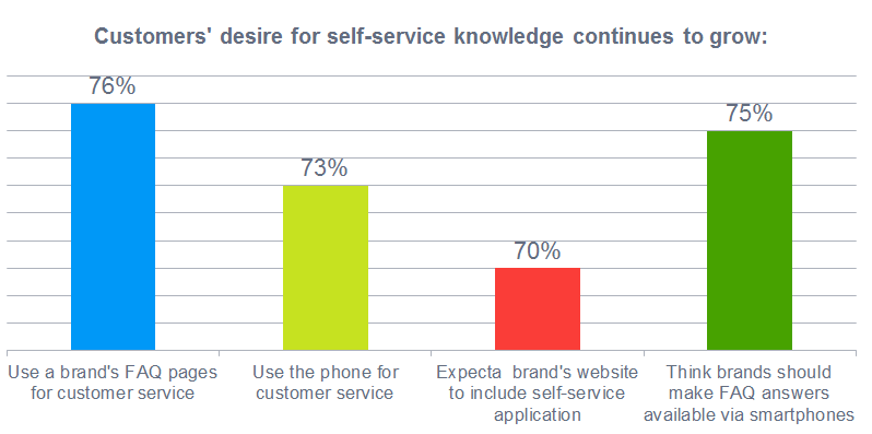
According to a report called The Real Self-Service Economy, 70% of website users now expect a company’s website to include a self-service application.
This supports the most recent Customer Life Cycle Survey from Forrester Research. It found that buyers are now using the self-service FAQ pages on a company’s website just as often as speaking with an agent on the phone.
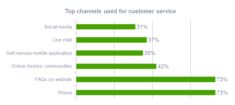
Self-service expectations are high. By creating an effective FAQ, you are delivering an excellent service. But that’s not all. An effective FAQ can also help you increase sales, reduce incoming calls and help you build trust.
Here’s how:
1. Reduced phone calls and email requests
Every incoming phone call and email to your business comes at a cost.
In the UK, National Rail Enquiries achieved a fourfold reduction in operating costs by shifting 80% of customer requests from their phone lines to their website. Their phone lines are still available for customers that need them, but their website is now designed to handle the bulk of requests.
A good FAQ will reduce the workload on your employees and allow you to provide the right answer to your prospects, first time. Phone calls and emails that keep coming in after your FAQs are live provides valuable data to understand what questions might be missing.
We used to have a big problem with our own FAQs.
The biggest complaint we received from our customers that browed our FAQ section was that “we cannot find what we are looking for”. Obviously, this is not the kind of customer experience we want to deliver.
In early 2017, we began a project to clean up the FAQ section – merging content, removing outdated content and ranking content by most popular response (based on customer feedback score).
At the end of 2017, out FAQs had been read by more than 53,000 times.
Fast forward to today and our FAQ section has been read by more than 300,000 times!
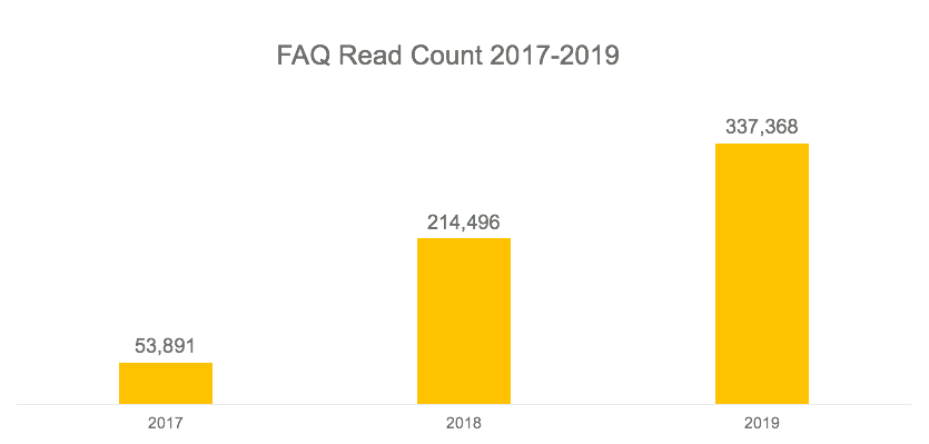
The SuperOffice FAQ section is now an easy-to-navigate and helpful resource center for our customers – and is available 24/7.
Best of all, feedback from customers shows they now “find what they are looking for”, which has resulted in fewer support tickets.
2. A direct increase in sales
A study by Harvard Business Review, which surveyed more than 7,000 consumers, found that online sales increase dramatically when companies help website visitors easily find information about a product or service. This means helping website visitors find product and pricing information, contact options and answers to any questions they have during the purchase process.
The results from the study found that when a company provides this kind of information about its products and services, consumers are 86% more likely to purchase a product, 9% more likely to repeat a purchase and 115% more likely to recommend your website to others!
3. Enhanced perception of the company’s expertise
Every company is an expert - and not just on its own products and services.
An FAQ lets you go beyond the general specifications and features of what you’re offering. You can also answer broader questions about your subject matter to inform potential customers. Your company needs to show why it has a unique expertise to provide the best product or service in your industry.
8 Ways to Create a Great FAQ Section
Now you know the benefits, here are 8 important things to bear in mind when creating an FAQ.
1. Keep your FAQ conversational
FAQs are often as dull as a list of terms and conditions you’d expect lawyers to write.
An effective FAQ should be written exactly as you would expect to hear questions and answers in real life between a prospect and a member of your sales team.
First, think carefully about the demographic you are targeting. Your prospects should be able to hear the questions in their own head as they read them.
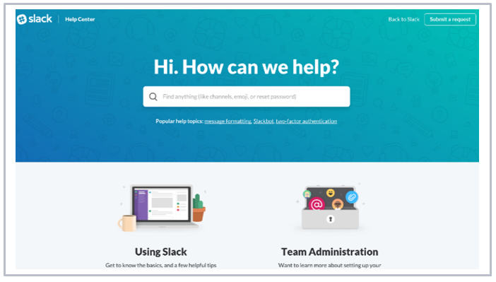
So instead of the standard ‘Welcome’ message at the top of the page, you can use “Hi. How can we help?” just like Slack does in the example below.
2. Don’t skip the basics
Basic information about your company forms the most common questions so these answers should be the most accessible.
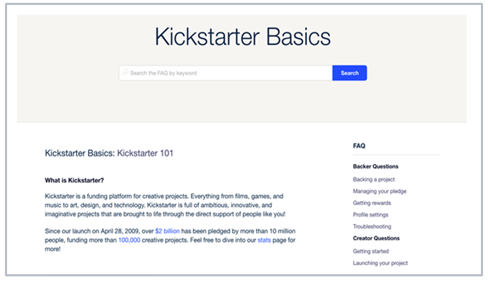
Some of the most obscure companies can completely fail to say clearly what their company actually does anywhere on their website. It’s important to remember however that many of the best FAQs for the biggest companies start with ‘what is [the product]?’ or ‘how does [the company] work?’
A great example is Kickstarter. Kickstarter is used by more than 10 million people, but its no-nonsense opening question on their FAQ is ‘What is Kickstarter?’.
You know your company inside out, but being closely involved creates blind spots in understanding how others see it. Potential customers just won’t understand your products and services anywhere near as easily as you.
3. Answer all questions directly
It takes a certain skill to answer a question without actual answering them (think of a politician), but that’s not going to help you reassure a prospect that is visiting your FAQ who has a specific concern.
Don’t shy away from including the tough questions and don’t waffle to avoid answering it properly.
There may be issues you don’t want to discuss, such as pricing information or how you compare against a competitor, but if a prospect is asking these kinds of questions, then you need to answer them. Otherwise, they may turn to social media and ask these questions, which can lead to speculation or even incorrect answers! A confident and direct answer on your website can dispel that.
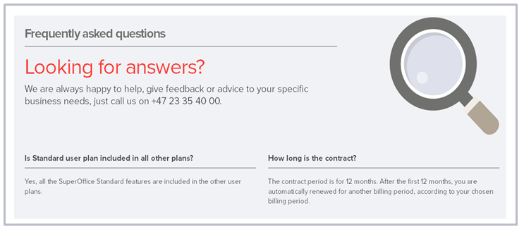
Underneath our pricing plans, we provide a short FAQ section to answer questions from potential customers, clearly answering each question with a yes or no. If possible, restate the question clearly in your reply to make it clear that it’s being answered.
4. Make your FAQs easy to navigate
Your FAQs need to cover common questions for everyone, but each individual visitor must be able to easily find their own specific concerns.
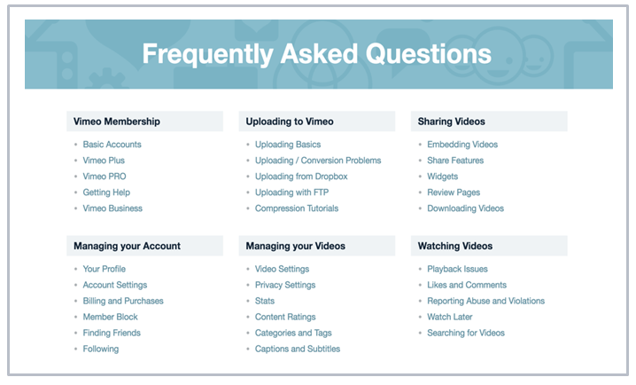
If there are a lot of questions, then group them by topic or theme. Ensure visitors can then quickly search or jump down to the right answer without scrolling through irrelevant information. But if you make this difficult for them, prospects will quickly click away and shop elsewhere.
Vimeo is a great example of how to answer an enormous volume of questions. Despite the large amount of information, everything is clearly laid out by topic and subtopics before you reach the next page of questions.
5. Show your creative side by using video
Many FAQs read like terms and conditions. But, there’s no need for them to look like terms and conditions either.
Your FAQs can be as creative as any other form of marketing produced by your company. Make it visual, be quirky and use multimedia if you can. Many companies, like Wistia, now incorporate video into their FAQs.
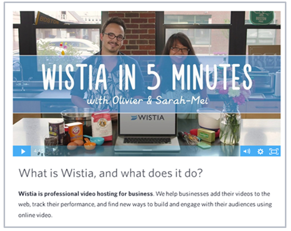
Always remember that visitors to your FAQs are looking for clarity so only use creativity to support this. If it obscures the answers instead then the whole purpose of the FAQ is lost.
6. Position your FAQs in the buyers journey
Many companies push their FAQs to one side – quite literally.
A side link on the homepage could be useful, especially if you’ve put together a large wealth of information. But if you’re proud of your FAQs (and you should be) then there’s no reason you can’t put them front and center.
Plus, a prospect might only start thinking of important questions once you have guided them towards the opportunity to purchase. Make your FAQs visible at the very point at which deeper questions might start to arise.
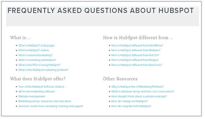
HubSpot’s FAQ have been arranged by phase of customer journey. For example, it starts with “What is HubSpot?”, and then moves onto answering questions about how it compares to competitors and finally, how to calculate the ROI.
7. Use clear ‘Call To Actions’ in your FAQ
A Call To Action (CTA) is an instruction to readers designed to create an immediate response.
Think carefully about what you want your readers to do as a result of reading your FAQ – or even just specific answers. Your FAQ will now be part of their decision making process so make sure it doesn’t lead to a dead end.
You could guide them directly to your web form with links such as Get an instant quote or Contact us now. Or, for instance, ask for feedback on how helpful the article was or if there’s a need to contact support, just like CrazyEgg does at the bottom of each FAQ article in their FAQ section.

8. Optimize your FAQs for multiple devices
You’ve created your FAQ section on a desktop, but most of your FAQs will be read on mobile devices.
65% of web browsing now takes place on mobiles so an effective FAQ must be mobile-friendly. This means not just optimizing the design, but also ensuring their state of mind is taken into account.
Website visitors are extremely impatient. Mobile visitors even more so! They are likely to be “on the go” and won’t wait until they arrive home or at the office to make a call. They want their answers now!
In fact, a recent study by Synthetix found that 75% of consumers think companies should make answers to all their common questions available via smartphones.
By making your FAQ mobile-friendly, you allow prospects to find answers to their questions immediately. That’s being proactive. And that’s a great way to keep the attention of your most demanding buyers and reduce incoming calls.
Conclusion
Website visitors expect fast answers and they expect to find them online.
An FAQ section is fast becoming an essential resource for every company. It’s a valuable opportunity that you shouldn’t cast aside. Literally!
FAQs play an important role in the overall customer experience. A great experience is one of the fastest ways to turn a prospect into a customer. These 8 tips will ensure your FAQs help prospects easily find the answers they need and then complete their purchase. All without having to contact you. Who doesn’t want that?
Do you have any tips to share on how to create an effective FAQ?


